Andrew Hurrell • July 30, 2025
The Most Common Web Design Mistakes (And How to Avoid Them) 🚫
Don't let daft mistakes cost you business when they're so easy to fix

Right, let's have a proper chat about websites. I've been doing this for years now, working with all sorts of businesses across Essex, and I keep seeing the same bloody mistakes over and over again.
It's doing my head in because these business owners are losing customers left, right and centre - and they don't even know it.
The mad thing is, most of these problems are dead simple to fix. You don't need to be some tech wizard or spend thousands of pounds. You just need to know what you're doing wrong.
So here's my list of some of the biggest website disasters I've come across, and how to sort them out without breaking the bank.
Stop Making Your Homepage All About You 🎯
Right, this one's a bit tricky because I'm not saying awards and certificates are rubbish - they're brilliant for building trust.
But here's the thing: they shouldn't be the first thing people see when they land on your website.
When someone's boiler's packed up on a Sunday night, they don't want to read your CV. They want to know you can fix their problem, fast.
Lead with that, then back it up with your credentials.
Let's pluck a plumber out of the air. His old homepage started with "Surrey's premier heating specialists with decades of combined experience and multiple industry awards."
All true, but it made him sound like every other plumber out there.
Now if we change his headline to "Boiler Broken? We'll Have You Warm Again Tonight" and then put his Gas Safe registration, customer reviews, and industry certifications right underneath.
Same credentials, but now they're supporting his promise instead of replacing it.

People want their problem solved first, then they want reassurance that you can actually do it. Give them both, but in the right order.
The trick is: lead with what they get, then prove you can deliver it. Your awards and certificates are the proof, not the promise.
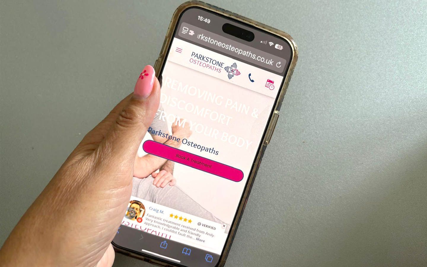
Where's Your Phone Number? 📞
This drives me absolutely mental. Someone needs to call you for whatever reason - they want to call NOW. But can they find your number?
It's either microscopic text at the bottom of the page, or buried three clicks deep on some contact page that takes forever to load.
By the time they find it, they've already called your competitor.
Stick your number at the top of every page. Make it massive. Make sure it works when people tap it on their phones.
This isn't rocket science.
Your Website Looks Pretty Ropey on Phones 📱
Half the websites I see look alright on a computer but turn into a complete dog's dinner on phones.
Text so small you need a magnifying glass, buttons you can't press without fat fingers, and menus that don't work.
Here's the thing - most people are looking at your website on their phones these days. If it doesn't work properly, you're basically telling them to get stuffed.
Get your phone out right now and look at your website. Can you read it without squinting?
Can you find your number and actually call it? If you're struggling, so is everyone else.
Those Fake Photos Aren't Fooling Anyone 📸
Oh, don't get me started on the stock photos. You know the ones - some woman in a hard hat grinning like she's just won the lottery, pointing at absolutely nothing.
Or the chap in pristine overalls who's clearly never held a spanner in his life.
These photos are about as convincing as a chocolate teapot. They make your business look fake, generic, and boring.
Get your phone out and take some real pictures. Your actual van, your actual team, your actual work. Even a slightly wonky photo of you fixing someone's tap is worth ten of those fake stock images.
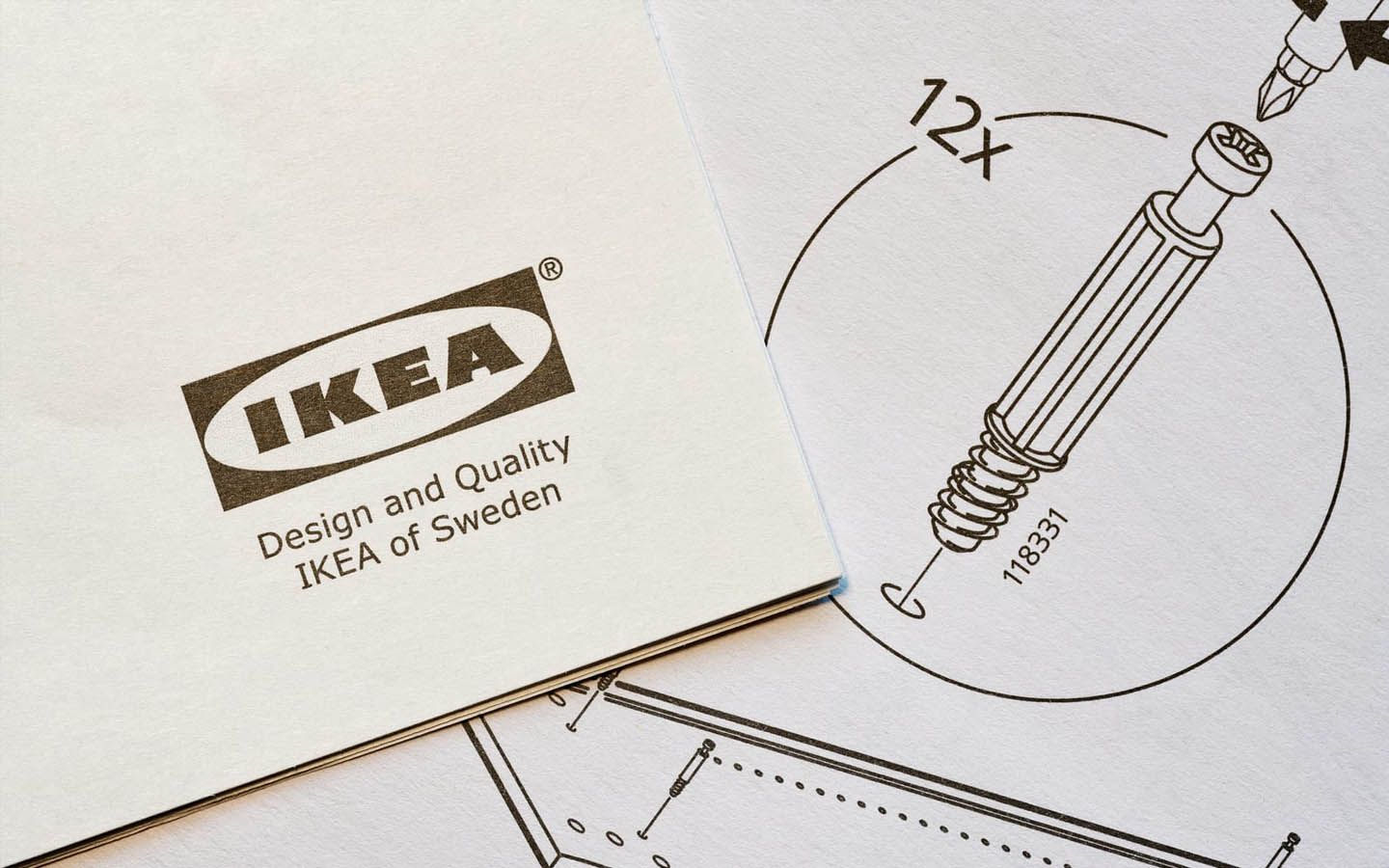
Your Menu's More Confusing Than IKEA Instructions 🧭
Some websites have menus with about fifteen different options, half of them using words that nobody actually uses in real life.
"Solutions." "Offerings." "Capabilities."
What does any of that mean?
If I need my gutters cleaned, I don't want to hunt through your "domestic solutions portfolio."
I want to click on "Gutter Cleaning" and be done with it.
Keep it simple. Use normal words that normal people use.
Your customers aren't trying to impress anyone - they just want to find what they need without getting a headache.
Where Are Your Happy Customers? 🌟
Your website's got no reviews, no testimonials, nothing to show that real people have actually used your services and lived to tell the tale.
Before anyone hires a tradesman these days, they want proof you're not going to do a runner with their deposit or make a right mess of their house.
Show them your Google reviews, stick up some testimonials, put photos of jobs you're proud of.
Even if you're just starting out, ask your first few customers to say something nice about you.
Most people are happy to help if you've done good work for them.
Your Website's Slower Than a Wet Weekend 🐌
Nothing kills a website faster than making people wait around. If your site takes ages to load, people will disappear and find someone else.
We're all impatient these days.
Usually it's because someone's chucked massive photos straight from their camera onto the website without thinking.
Or they're using hosting that's cheaper than chips and about as reliable.
Sort your photos out before you upload them.
And don't be tight with your hosting - spend a few extra quid and get something decent. It makes all the difference.

What Am I Supposed to Do Next? 📢
Someone visits your website, likes what they see, then... nothing.
There's no clear way to get in touch, no obvious next step. They close the tab, thinking they'll call later, then completely forget about you.
Every page needs to tell people what to do. "Call Now." "Get Your Free Quote." "Book Today."
Make it obvious, make the buttons stand out, and don't make people think too hard about it.
The Bottom Line 💡
Your website doesn't need to win any fancy design awards. It needs to win customers.
That means being clear, honest, and easy to use - not flashy or complicated.
Most of these problems can be sorted in an afternoon. Start with the big ones - make sure it works on phones and people can actually find your contact details.
Then work through the rest when you've got time.
Don't let these daft mistakes cost you business when they're so easy to fix. Your website should be working as hard as you are to bring in new customers.
Sort these out and you'll be amazed how quickly things improve. More calls, more enquiries, more customers. What's not to like?
Marketing Made Simpler - You’re Not On Your Own
More Customers. Bigger Wins. Better Business.